The personal fitness app that evolves with you, so you never plateau
I started working on Vitogo with a few friends in 2011 and designed the iPhone app that became one of the top 3 paid health apps in Ireland (top 50 in the US). In 2015, I also designed the companion Apple Watch App.
With Vitogo, you’ll get the same quality workout from a personal trainer…without actually hiring one. All you need is access to a gym (or gym equipment) and your phone. Every fitness plan evolves with you, so as you progress, so will your workout. The Huffington Post named Vitogo as one of the "Top Fitness Apps of 2012." Read about it on Thrillist, the Huffington Post, Greatist, Complex, Palm Beach Illustrated, and Mashable.
Goal
Help people achieve their fitness goals by taking the guess work and confusion out of the gym.
The Problem
It’s no secret that strength training is a crucial component of a fit and healthy lifestyle. Whether your goal is to build muscle, lose weight, firm and tone, or just get healthy, strength training (along with proper nutrition and cardiovascular exercise) will help you achieve it. The problem is that starting a strength training program can be confusing and intimidating, and many programs only last a few workouts, a few weeks, or a few months, leaving people wondering what to do next.
Competitive Analysis
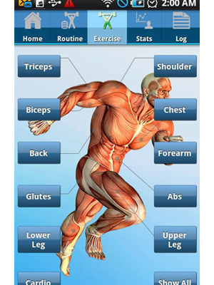
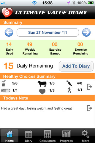
In 2011, there were already hundreds of strength training apps, websites, and books available, but none of these resources provided a simple path for regular people to quickly and easily begin strength training on their own. Many of these products provided essentially the same service: a database of a simple list of exercises that the user could choose from and in-app recording of exercises completed and amount of weight lifted.
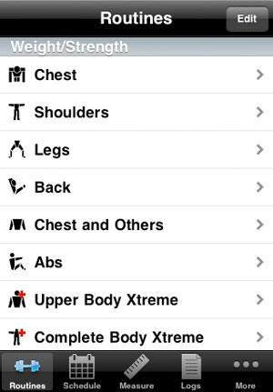


These products required users to already have a training program of their own that they wanted to record or forced them to choose from a list of programs organized by muscle group. None provided much guidance toward achieving fitness goals, especially for people who didn't know where to start. Additionally, none of these products moved users onto a new program periodically, which is essential if the user wants to see continual progression toward their goal.
User Research
Since this was a side project with limited resources, we followed a Lean UX approach to user research. Our main goal was to get a minimum viable product out in front of users as quickly as possible so that we could measure, learn, and iterate on our solution.
observation
What people say is very different than what they do, especially when it comes to their health and fitness. We spent a lot of time observing gym-goers in order to discover new insights and directions to explore, and to give a better behavioral balance to the rest of our work. I even took a part-time job at a high-end gym in Boston for a few months in order to better understand our users' behavior and goals.
Proto-personas
Instead of spending months in the field interviewing people, we created proto-personas - our best guess as to who is using (or will use) our product and why. This exercise helped capture our assumptions and gave us a baseline to adjust as we learned more about our users and target audience.
Content Strategy
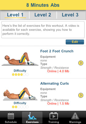
Our service doesn't work without great content (specifically, exercise programs). We worked with exercise scientists, kinesiologists, coaches, and personal trainers to develop the exercise programs behind Vitogo. Additionally, we shot all our own photos and videos for the app with the help of our friends at Scott P Yates Photography.


Minimum Viable Product
We shipped Version 1.0 of the Vitogo iPhone App in January, 2012. It was a basic version, and there were a lot of bugs, but it was a good proof of concept and it allowed us to start gaining more insights into our users' behavior and goals.
Refining and Iterating
Based on customer feedback and continued research, we continued to iterate on the app, releasing twelve more updates. I focused on streamlining the onboarding and registration flows, which is where we saw the greatest number of users dropping off.
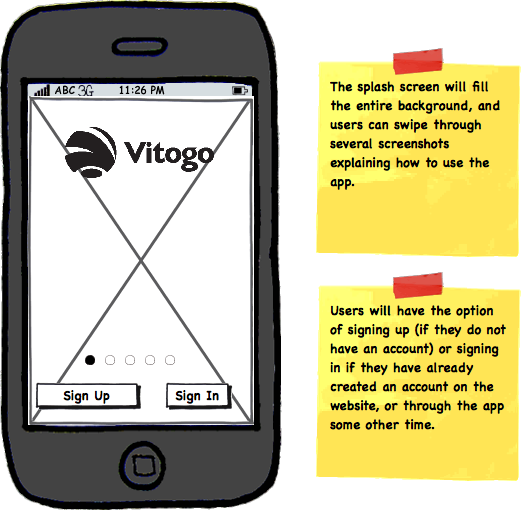

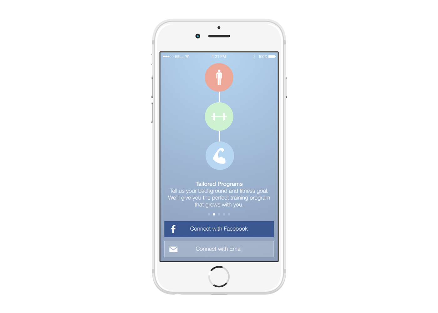
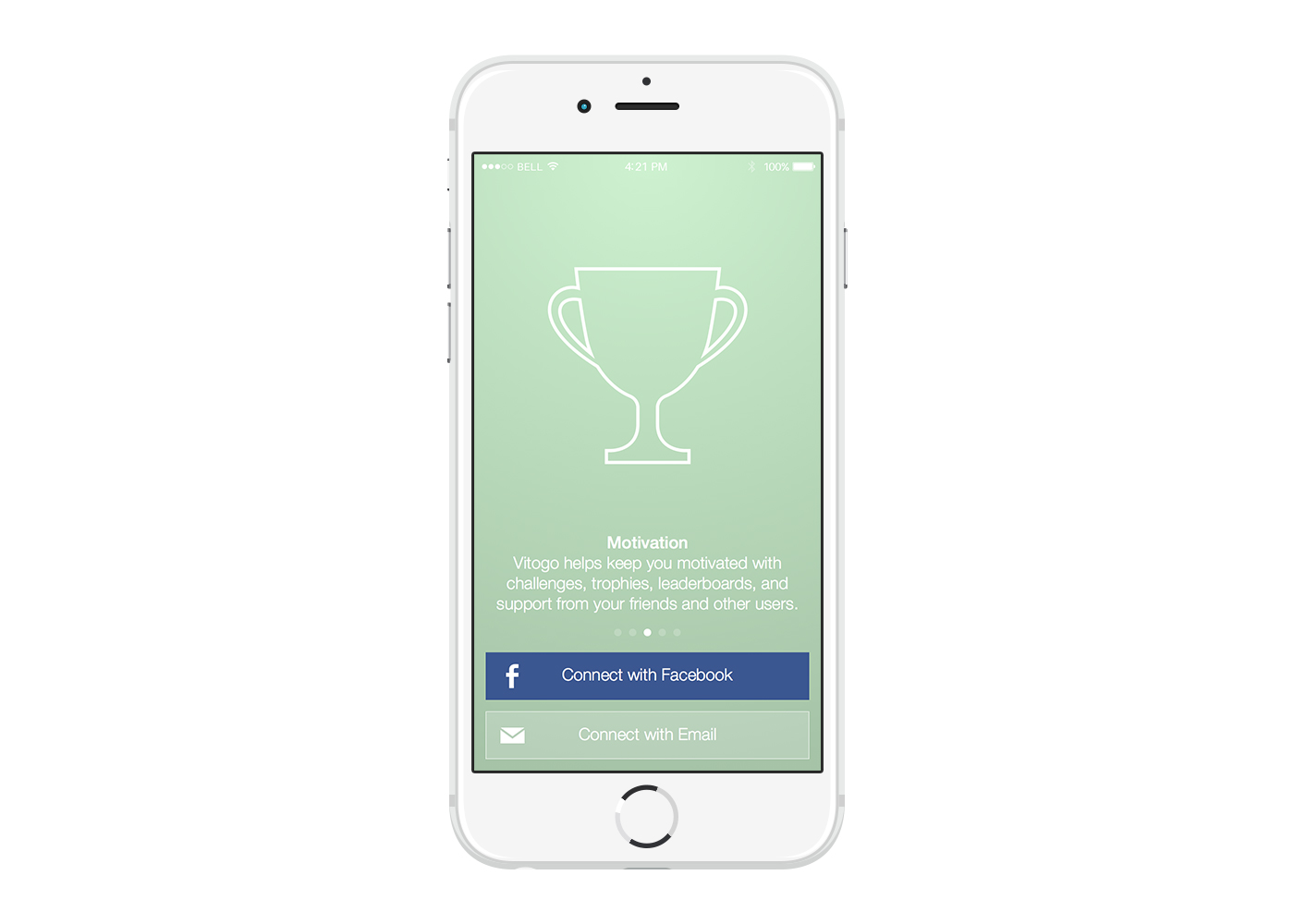
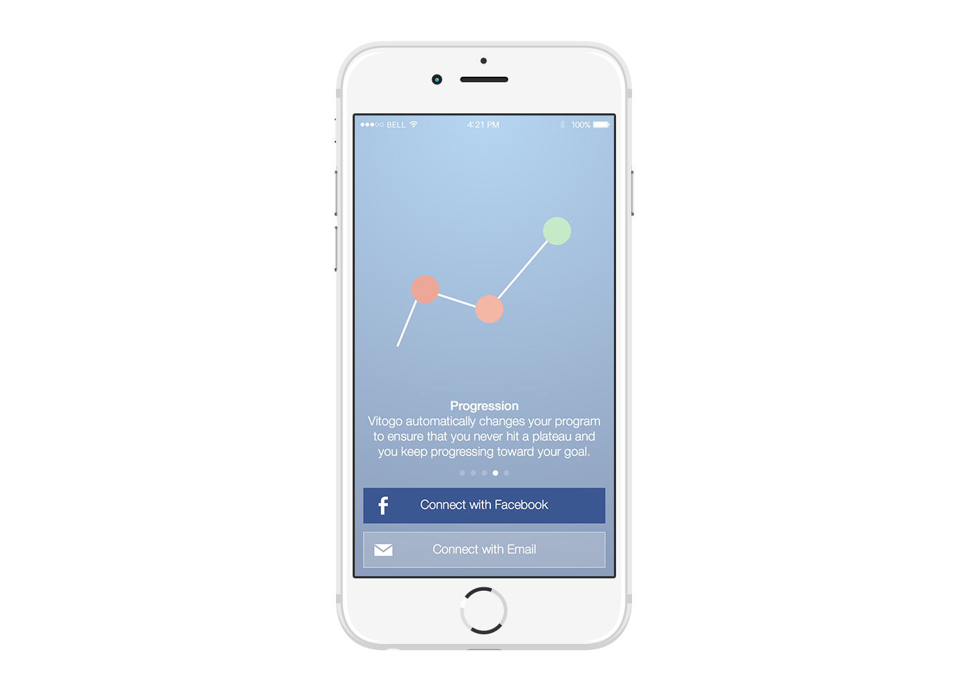
User Onboarding
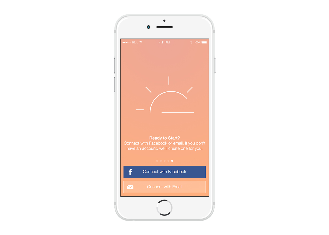
Vitogo requires users to create an account using either an email and password or Facebook Connect. In earlier versions, we saw a lot of drop off as a result of this registration wall. In order to help users better understand the benefits of creating an account, I designed a short tutorial that lists Vitogo's key benefits. The tutorial is completely optional and users can sign in or create an account from any screen.

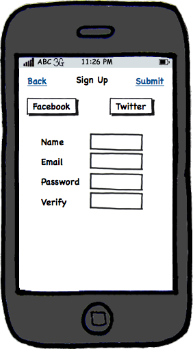
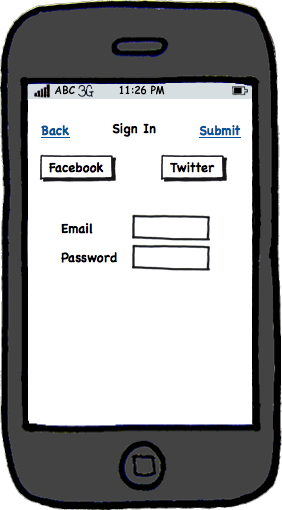
Log In/Registration Flow
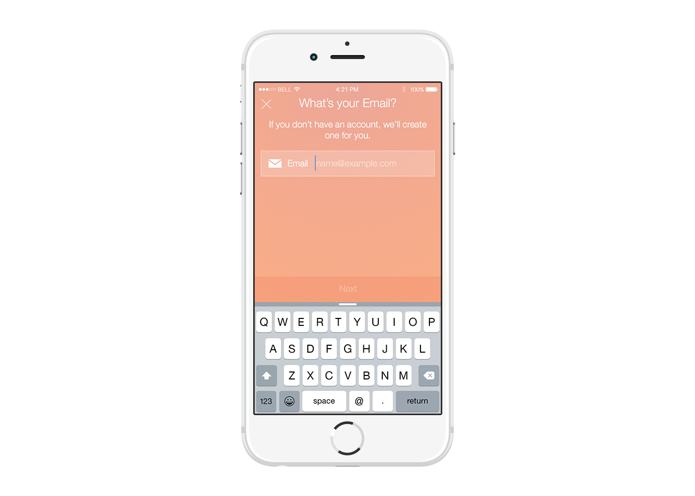
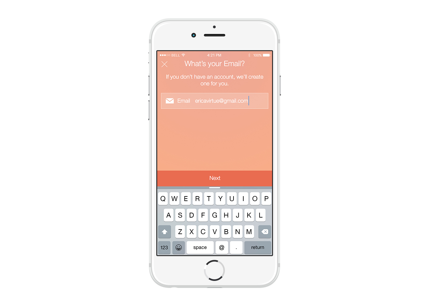
Since we wanted to make creating an account as quick and easy as possible, I decided to go with a unified log in/registration flow. If a user taps "Connect with Facebook," we will either log them in (if they already have an account) or start the registration process if they are a new user. If they tab "Connect with Email," we check to see if they already have an account, in which case we then ask them to enter their password to sign in. If they don't have an account, we ask them to create a password and push them into the rest of the registration flow. By only asking for one piece of information at a time, I hoped that this would lessen the initial knee-jerk reaction that some users had when they were first asked to create an account. This "one thing at a time" principle was something that I carried throughout the design of the entire app.

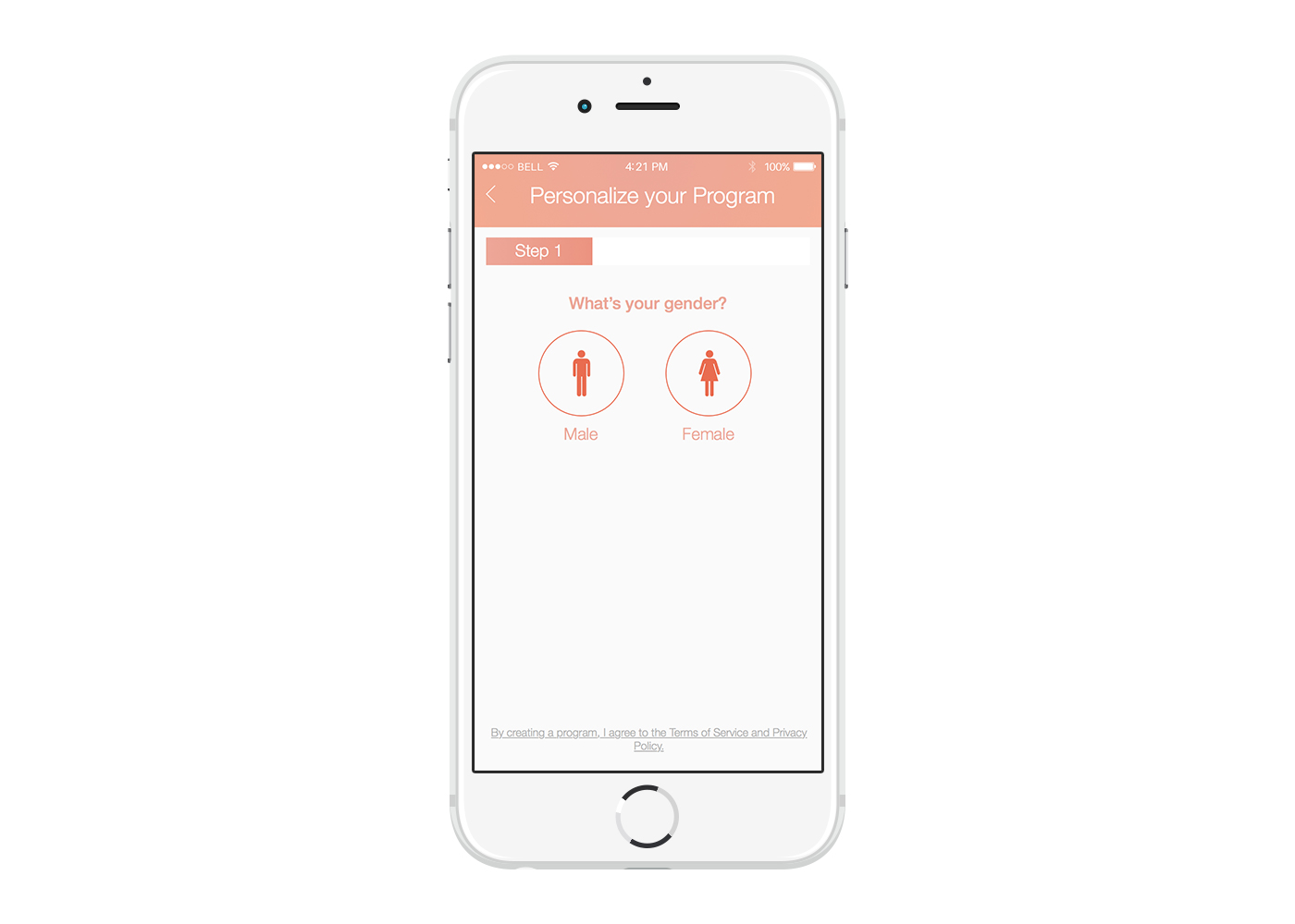
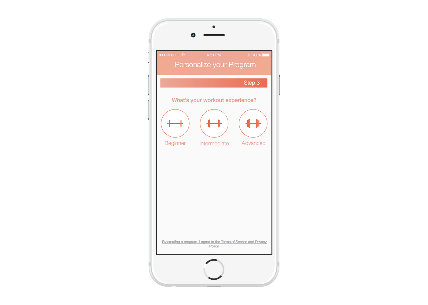
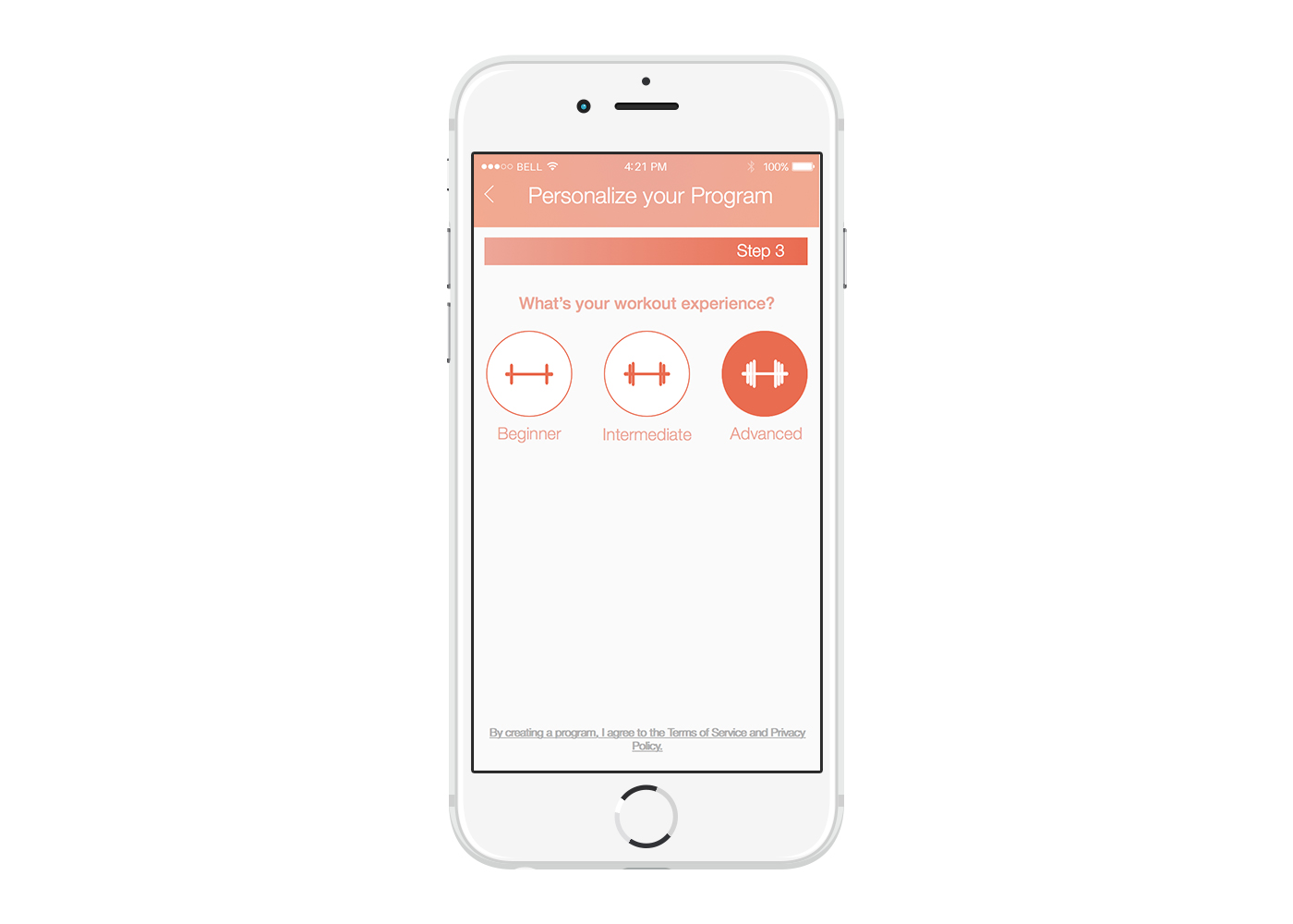
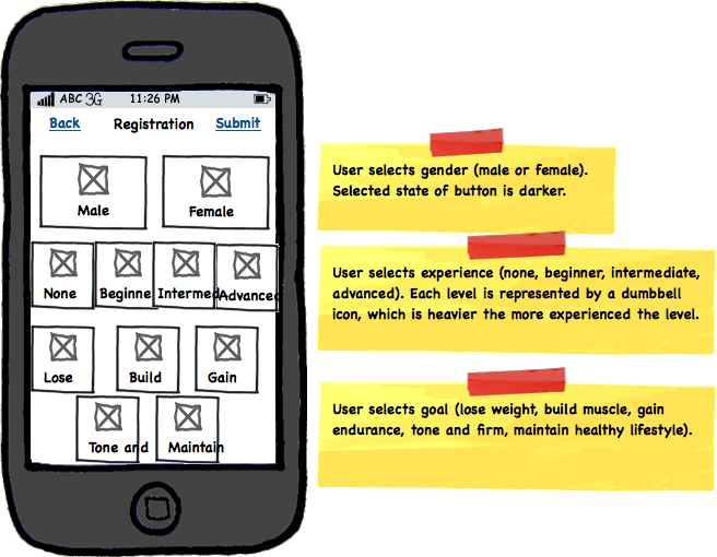
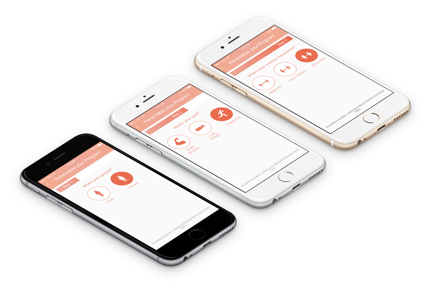
Program Personalization
We need to know a few things before we can build a user's workout plan - including gender, goal, and experience. We initially also asked for a user's weight in order to accurately calculate calories burned, but we removed this step since users seemed to find it a bit too personal of a question at this stage. The goal here was to get users through this flow as quickly and painlessly as possible. Again, I used the "one thing at a time" pattern and only asked one question per screen. I also added in a progress bar to (1) give users an idea of how long the personalization process was, and (2) encourage them to complete this process.
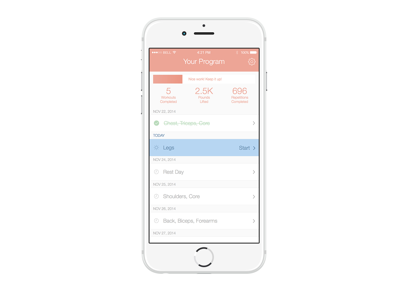
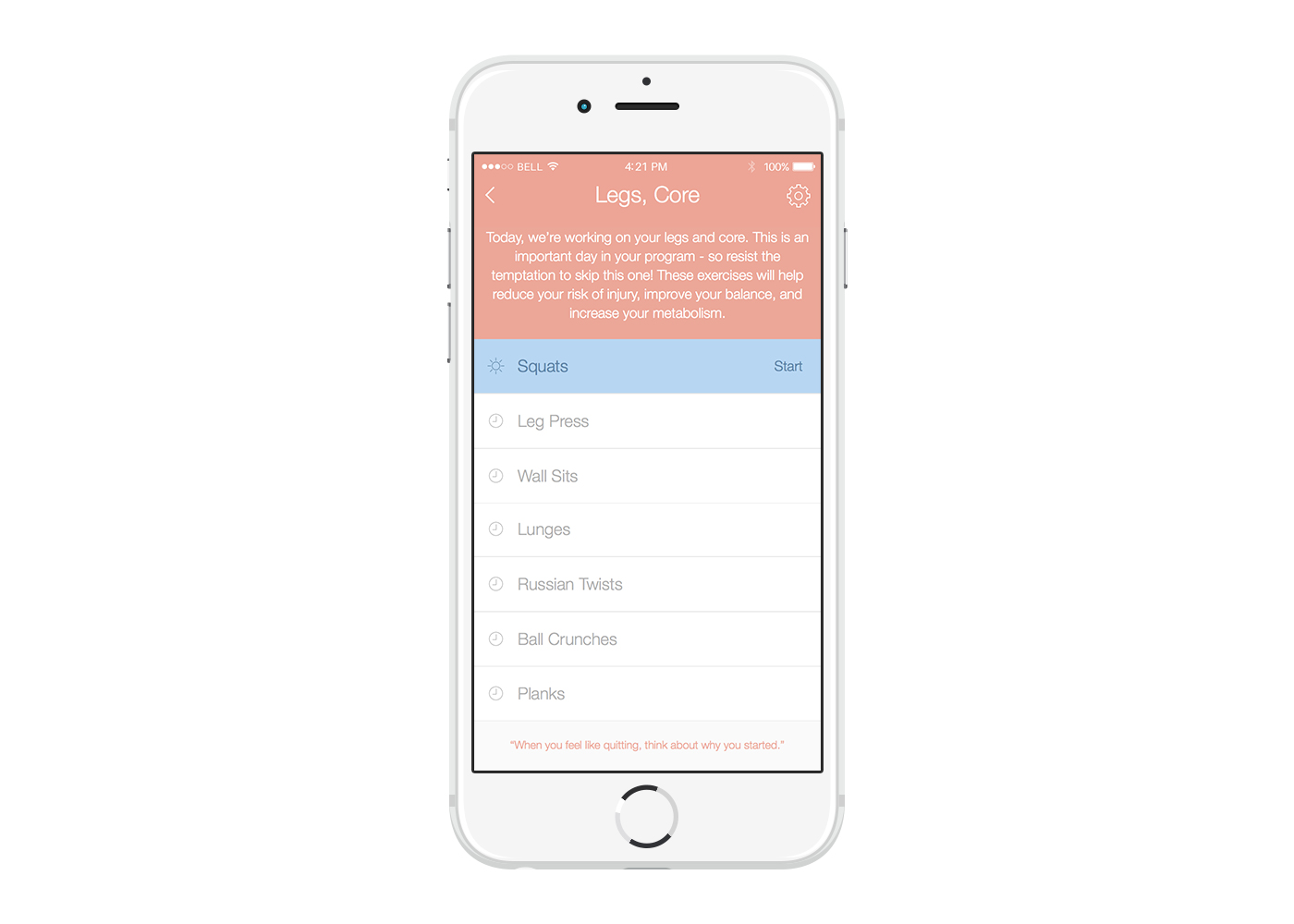
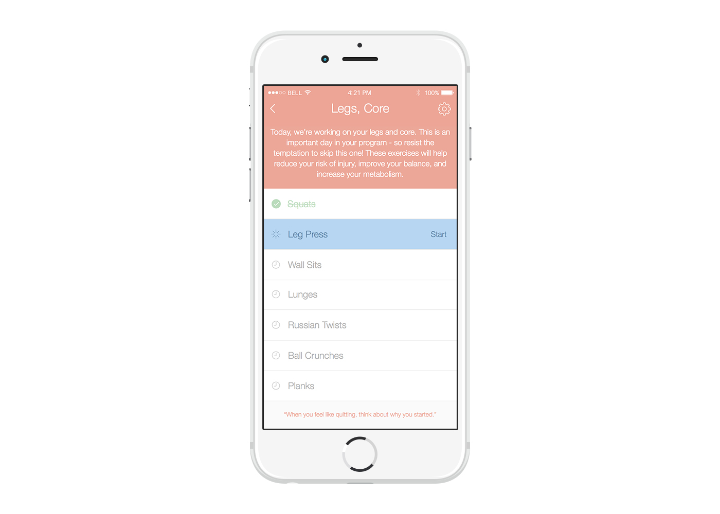
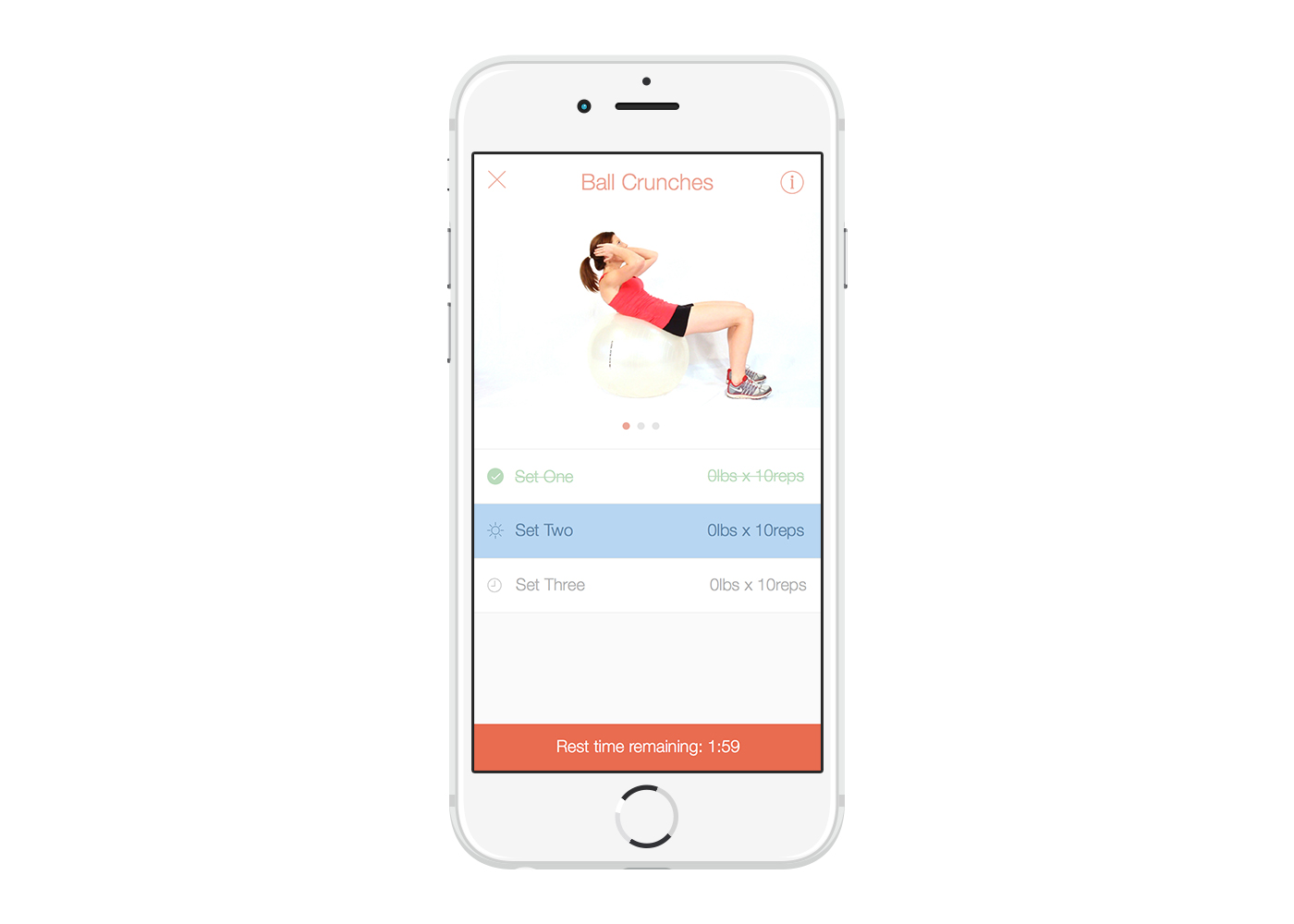
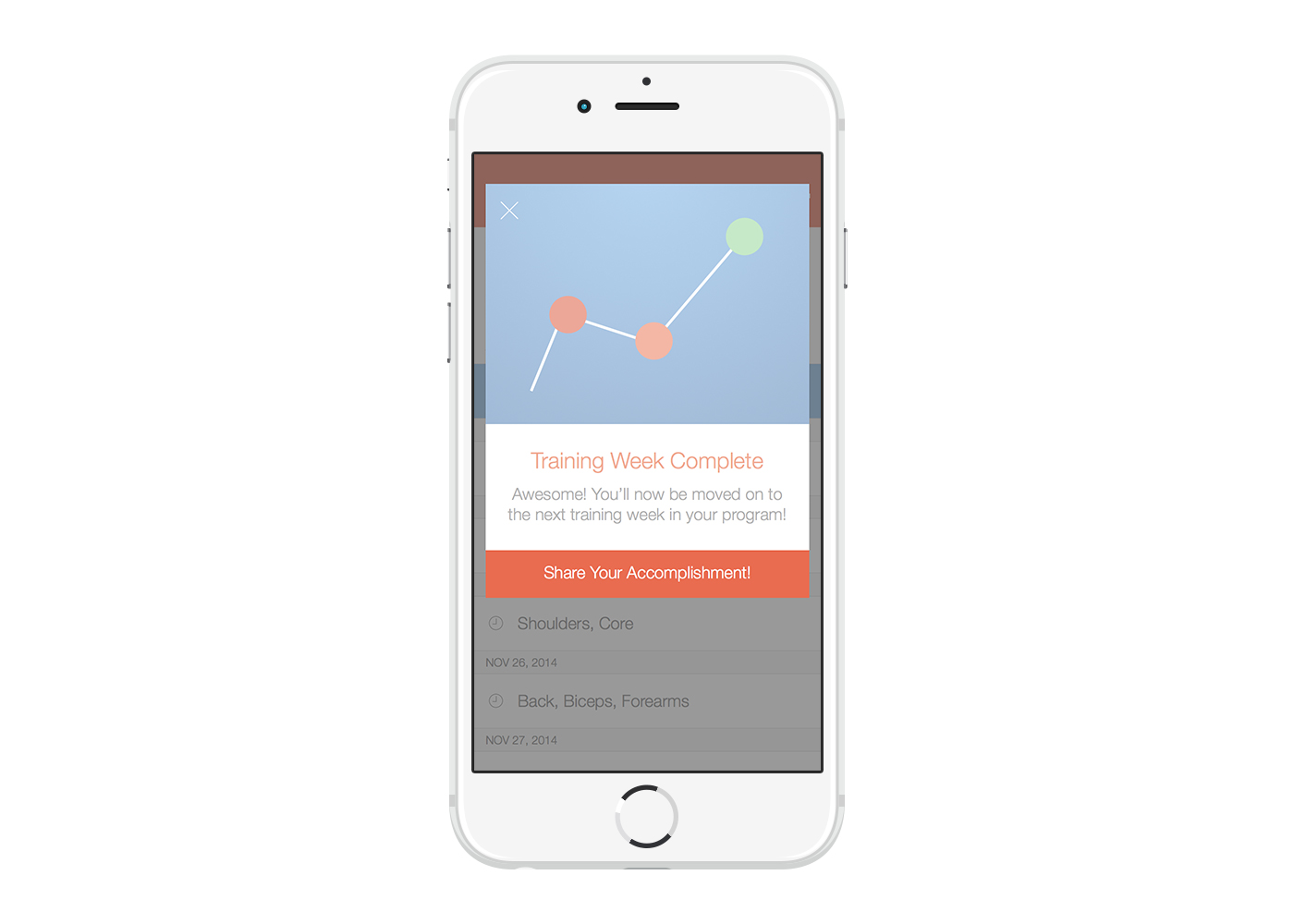
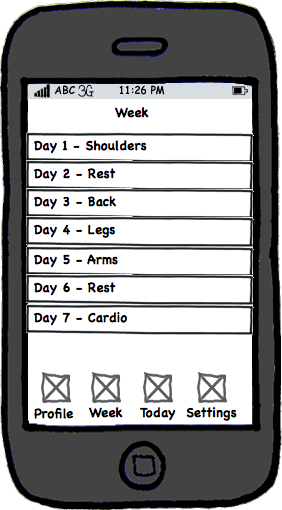
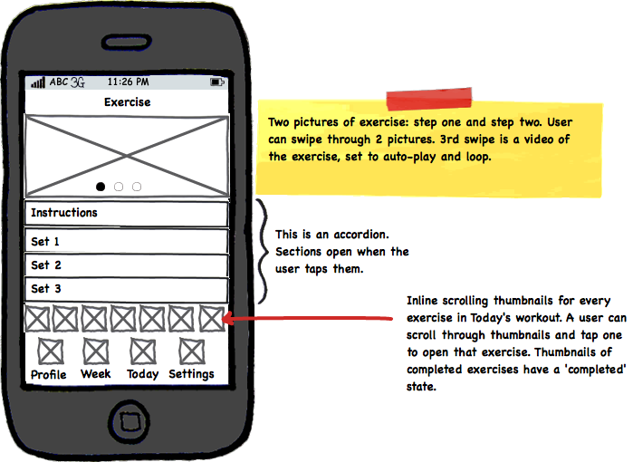
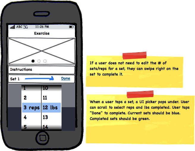
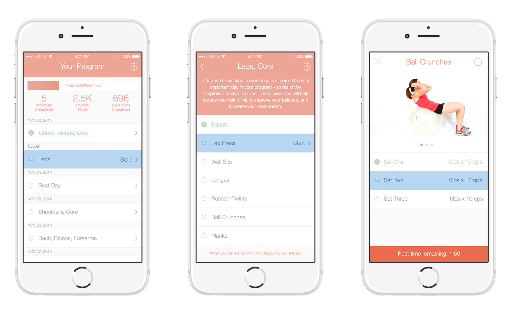
Workout Flow
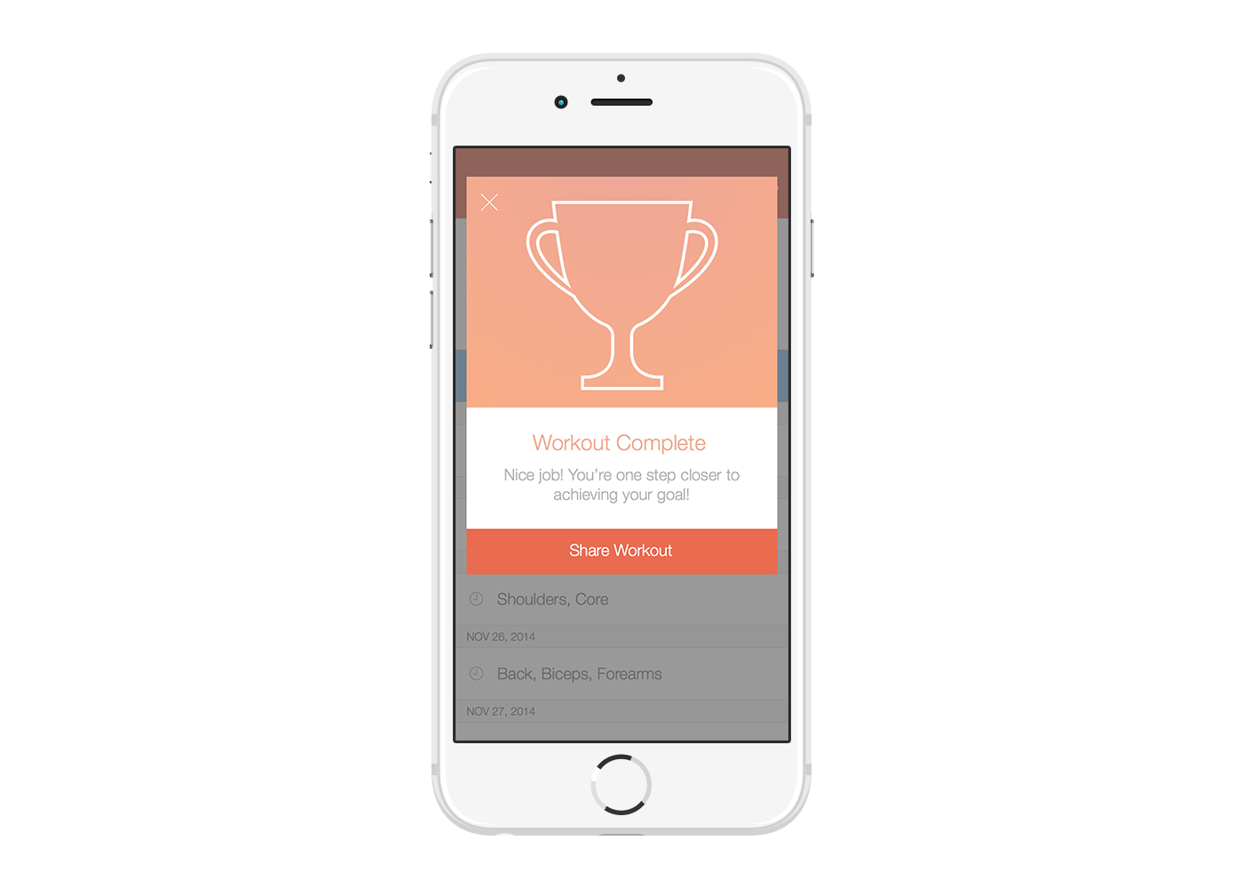
The workout flow includes (1) the program overview, which shows what workouts are scheduled on which days, (2) the workout overview, which shows the exercises in a particular workout, and (3) the exercise view, which shows the recommended weight and repetitions for each set of a particular exercise. Inspired by the satisfying feeling you get from crossing off an item from your to-do list, I created a strikethrough and checkmark pattern for completed workouts, exercises, and sets. I also added a progress bar and some vanity metrics (like total pounds lifted) to the workout overview to help our users stay motivated.
Alternate Approaches
I explored a lot of alternate approaches to every view of the app, but ended up going with other implementations because of usability concerns, technical constraints, consistency, or sometimes just because I came up with a better option. Here are a few examples of alternate approaches that I tried.


Vitogo for Apple Watch
When Apple announced the Apple Watch, we knew right away that we wanted to make a watch app for Vitogo. Constantly having to pull out your phone in gym to see what exercises are up next and how much rest time between sets is left has always been a pain point. We also thought it would be great if users who didn't need to edit the amount of weight or reps from last time could mark their sets as complete with one tap on the watch.
I started by reading through the Apple Watch Human Interface Guidelines and then started sketching some concepts. We wanted to make sure that the watch app didn't just duplicate all the functionality of the iPhone app; rather, we wanted to focus on quick, lightweight interactions that provided some extra value to the user. Since I had to start designing before the Apple Watch was actually released, I printed out my mockups to scale so that we could test for legibility and 'glancability.'


Retrospective
I learned a lot from working on this project - and we still have a long way to go. If I could start over, I think we would have scoped our MVP even more than we did. We thought that we were only building the features that we absolutely needed, but I think we probably could have been more ruthless in our feature cutting and released something much simpler in the beginning.
One thing that I think we did really well was actually shipping the MVP and iterating on subsequent versions. Especially since this was a side project, we could have obsessed about getting everything perfect and never actually launched anything. This was tough, but it allowed us to validate whether this was something that people would actually use. I often worked closely with the engineers to tweak designs to make them easier to implement.
Users responded well to the concept, user flow, and features of our MVP and the paid app has been downloaded thousands of times. However, many users were initially frustrated by bugs and crashes. We also received a lot of feedback around users wanting to customize their programs, skip certain days, or skip exercises. We've taken all this feedback in stride, and each version of the app has been better than the last.
App Store Reviews
"Love this app. I've been working out for years and Vitogo helps tremendously to keep me on a schedule and increase my activity. I love the fact that it remembers how much I lifted previously, cause sometimes I forget."
"I've been using Vitogo for a few weeks and I must say that I'm very impressed. It brings workouts into the 21st century. Really terrific customer support with amazingly fast replies to questions. A must have."
"I am just adding weights to my workouts, and this app makes it super easy - do these on those days. I DO wish there was a way to look into the future, as you can only see the current week's workout, and I wish there was a way to "start over" a week, but I think it is a great app for people who are looking to use weights but have no clue where to start."