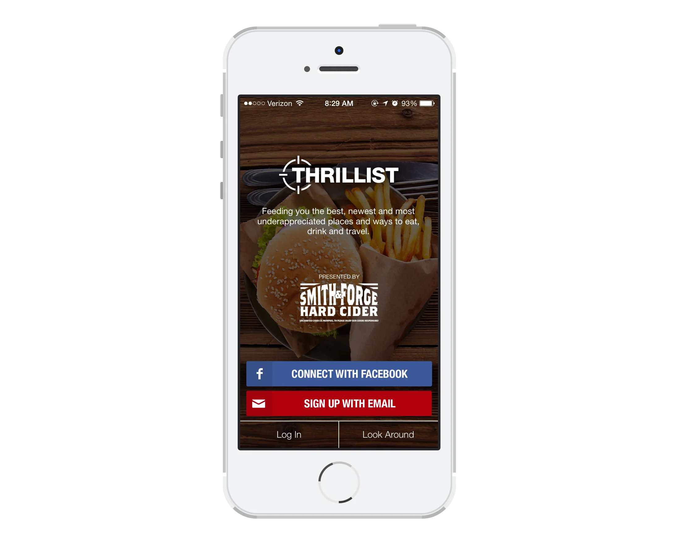
Helping our users make the most of every city
Thrillist is a men’s lifestyle site that recommends the best, newest and most under-appreciated places and ways to eat, drink and travel. When I joined Thrillist in 2013, the product team was working on version 2.0, a completely rebuilt and redesigned app for iOS 6. I assisted the team with product design and research leading up to the launch of 2.0, then became the lead product designer on the app and iterated on each version up to v. 2.5.1.
Read about it on Digiday or download the press release.
Goal
Increase user engagement, average session duration, and sign-ups, and decrease bounce rate for new users.
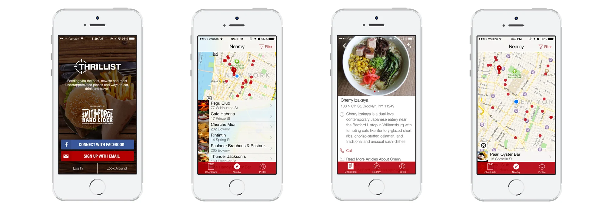
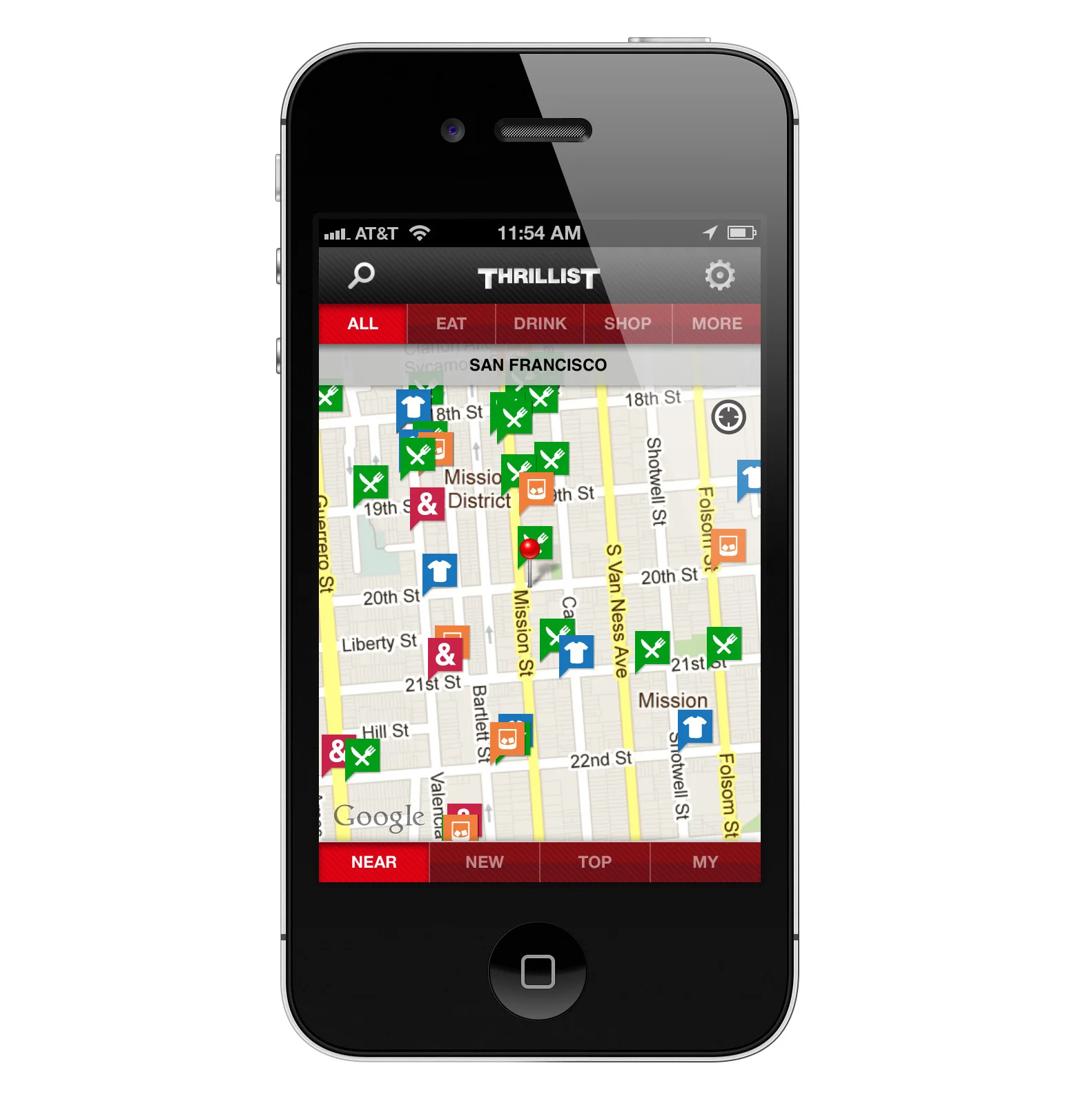
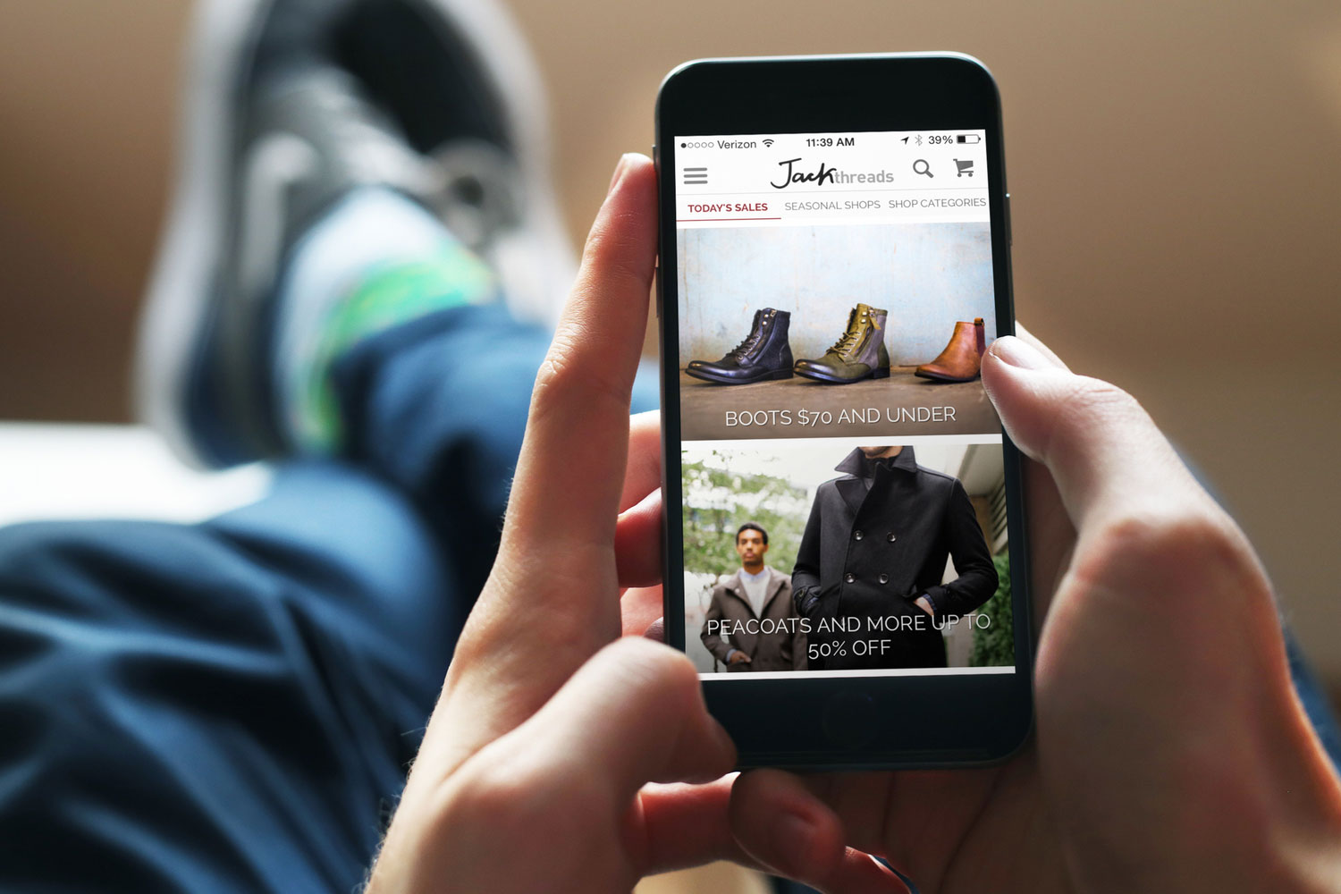
The old Thrillist app (Pre-Version 2.0) was a "dumping ground" for repurposed content from the Thrillist website.
Challenges
The old Thrillist iPhone App "used to be an afterthought, a dumping ground for repurposed content from the Thrillist website. You’d be able to read the articles, but the content didn’t make sense for the guy who’s out-and-about town, looking for a nearby sushi joint or dive bar" (Digiday). It had too many features, which were causing users to become confused and overwhelmed.
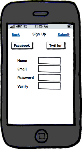
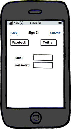
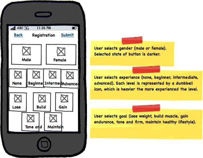
The app was plagued by confusing icons and labels, poor readability and information hierarchy, and too much irrelevant content. Users struggled to find nearby places and once they did, they had a hard time filtering the information down to something useable. There were multiple navigation and tab bars and a lot of important actions were hidden behind confusing labels. The app also required users to create an account before they could access any of the content, which caused a lot of users to abandon it before even trying it out.
“Awful UI, great content" - AppStore Review
For Version 2.0, we worked on a cleaner interface with a focus on the content, rather than bogging users down with extra UI.
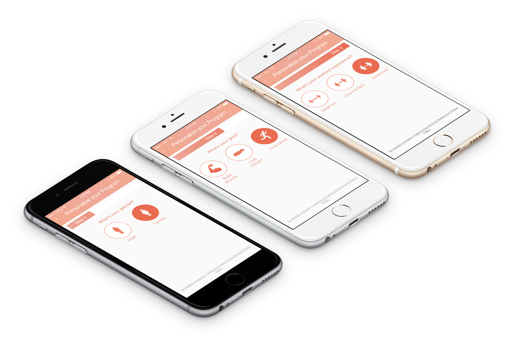
Version 2.0 Redesign
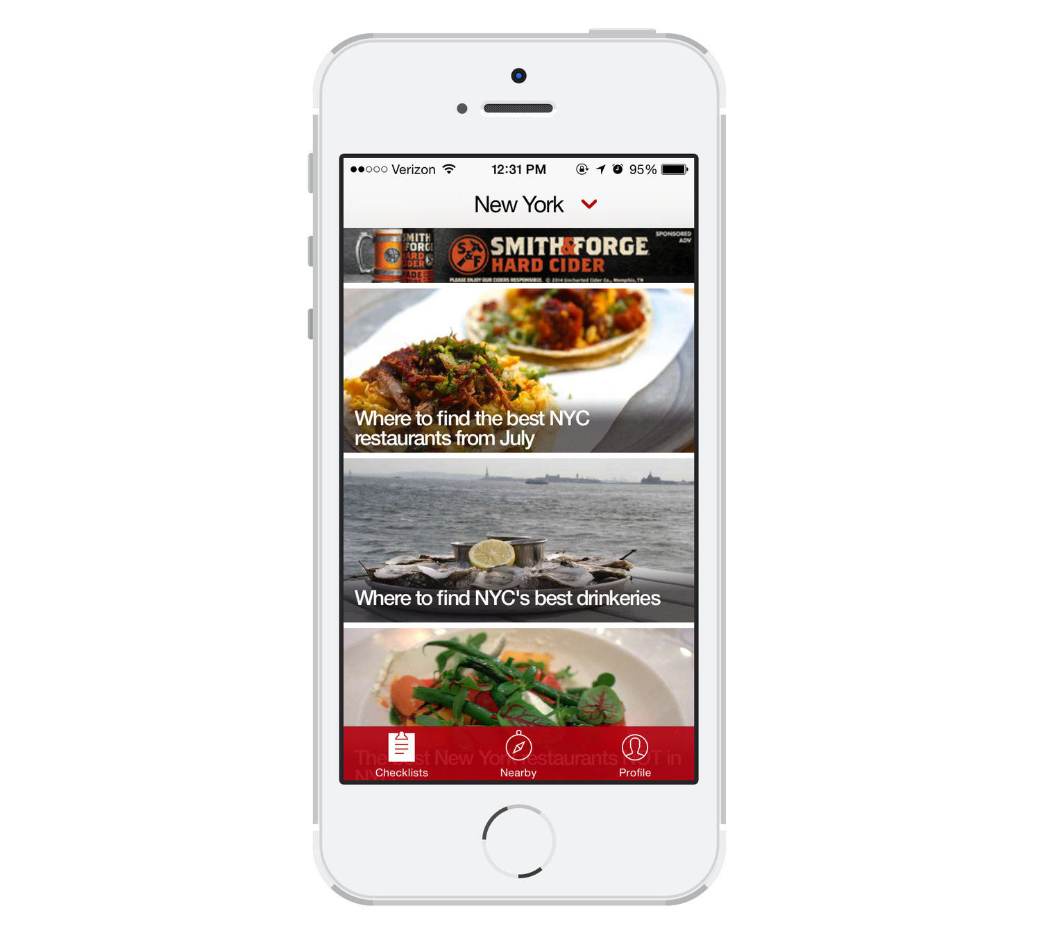
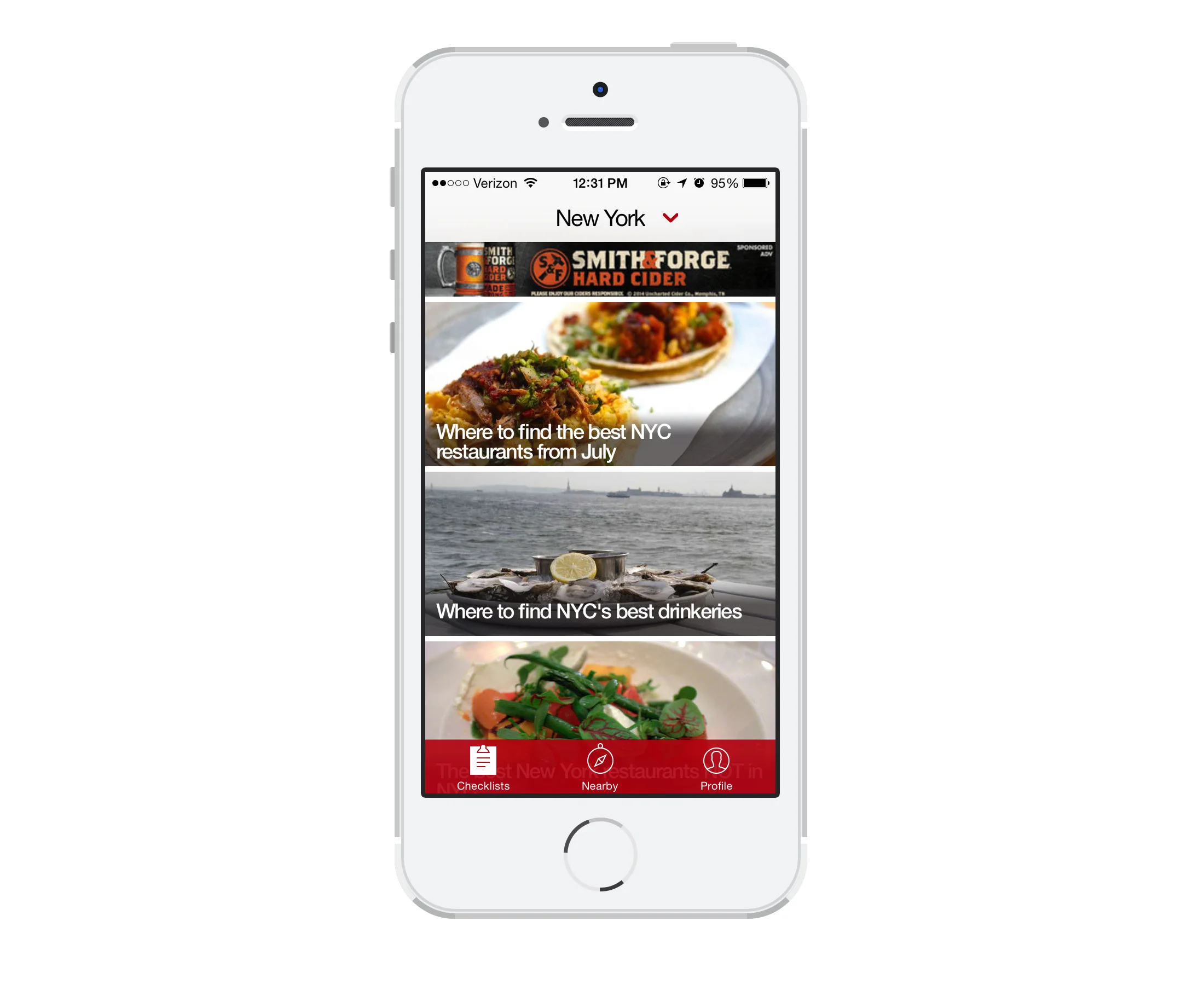
For Version 2.0, we worked on a cleaner interface with a focus on the content, rather than bogging users down with extra UI. We removed a lot of extra content and features, focusing only on providing bar and restaurant recommendations. The app also better adhered to Apple’s Human Interface guidelines than previous versions.
After the launch of 2.0, we saw over 35,000 new downloads and upgrades and we were featured by Apple in the App Store.
While Version 2.0 was a big improvement over 1.9, we knew that there were usability issues that we needed to address.
Iterative Improvements
We looked at Google Analytics and iTunes data, customer service feedback, app store reviews, and watched users actually using the app to figure out what we should tackle first.
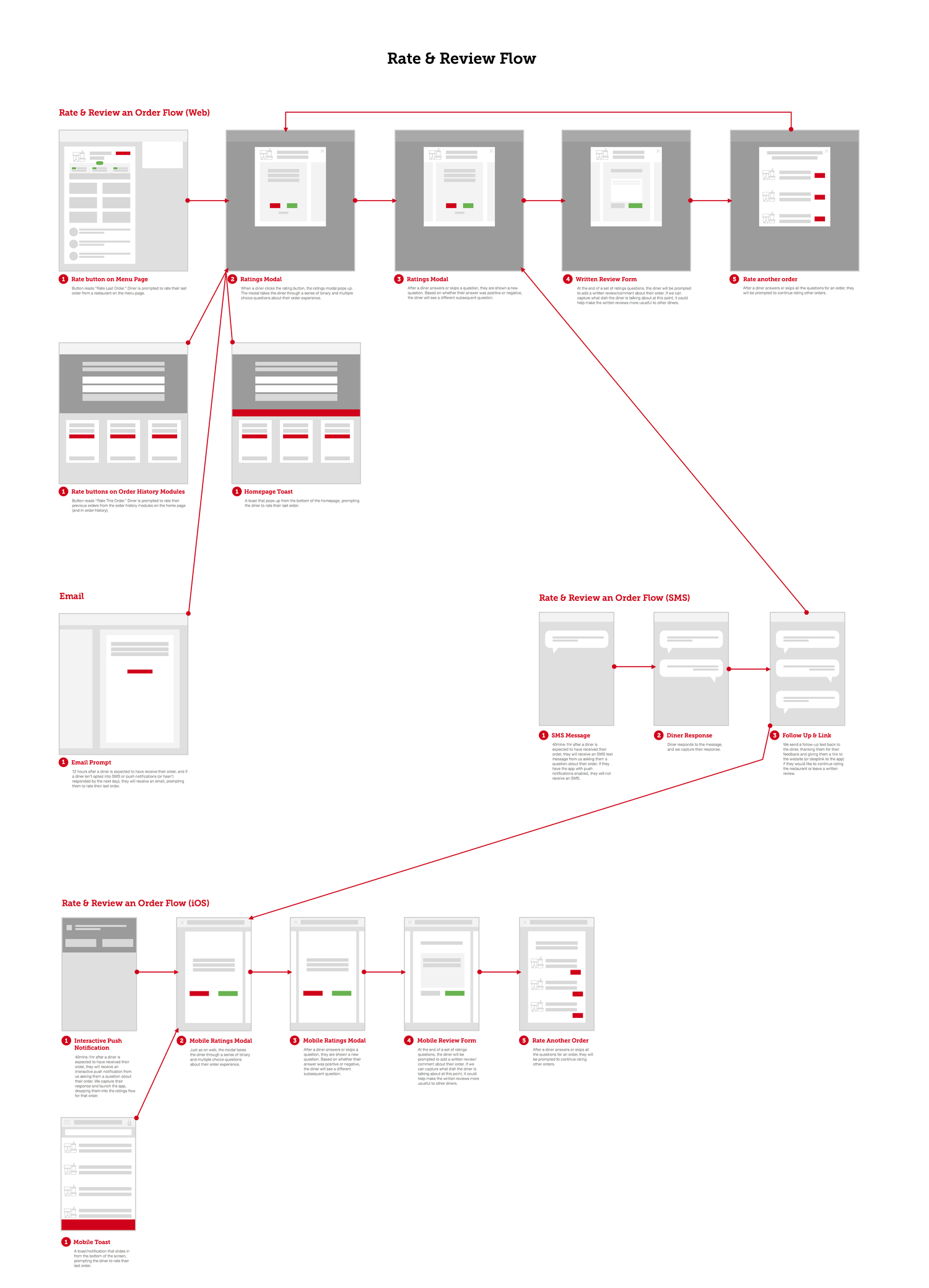
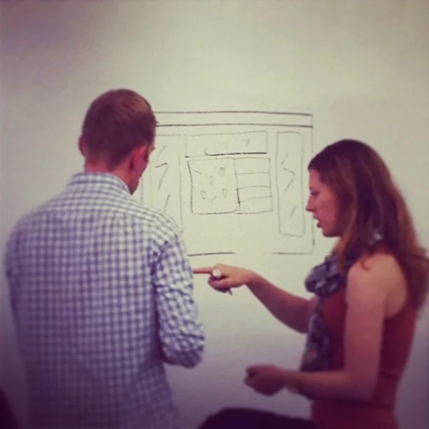
Since we didn’t have a lot of time between sprints, I sketched and whiteboarded flows and interactions in lieu of more formal wireframes. This also made it easier to collaborate with developers and try out ideas without spending too much time on design. After we settled on a layout that we wanted to test, I quickly moved to visual design, where I mocked up a number of concepts and experimentations.
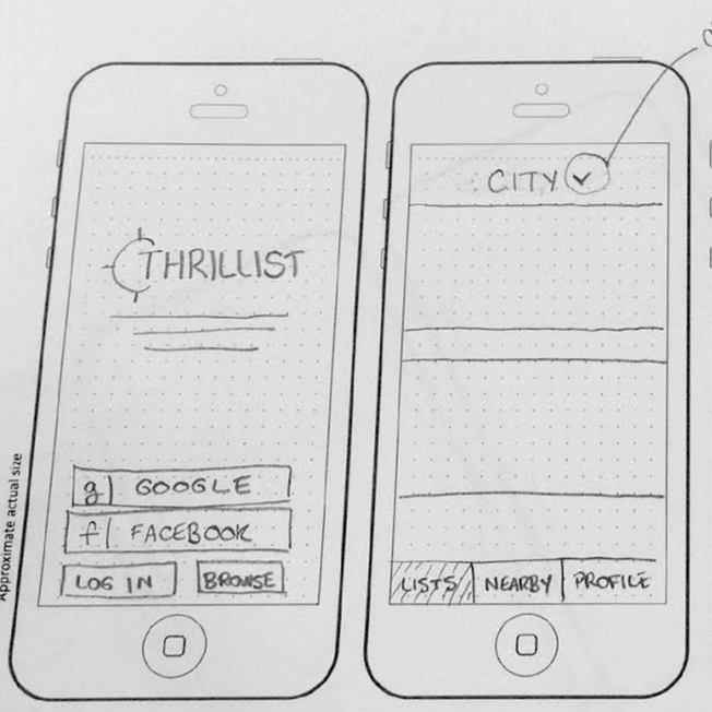
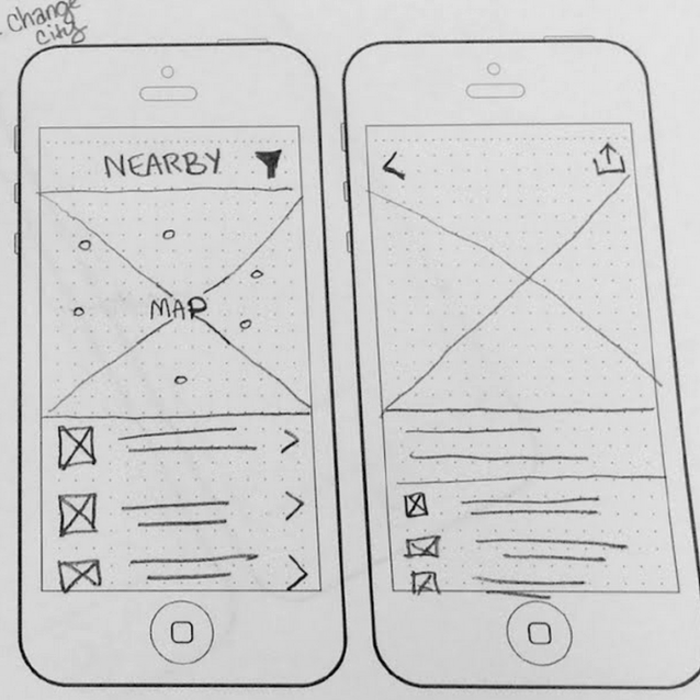
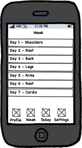
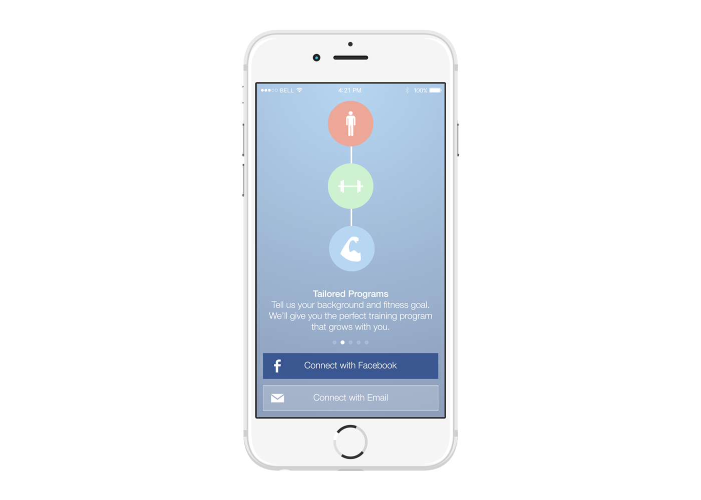
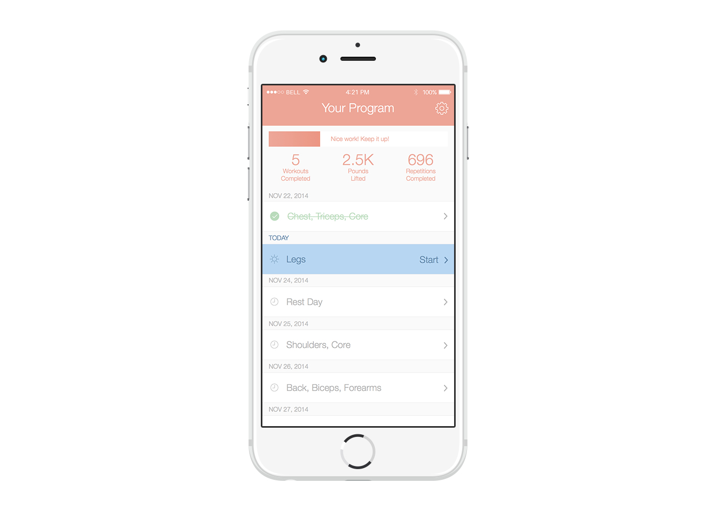
We saw in both the data and from users that people weren’t opening the side drawer menu and were missing a lot of crucial informational and navigational elements. Personally, I think that if you find yourself using a side drawer for navigation, it might be a good time to re-evaluate whether you can cut elements from the drawer and/or re-organize the information in a better way. I decided to replace the hamburger menu with a tab bar so that (1) it would be more obvious what the app did and (2) so that users could more easily navigate between views.
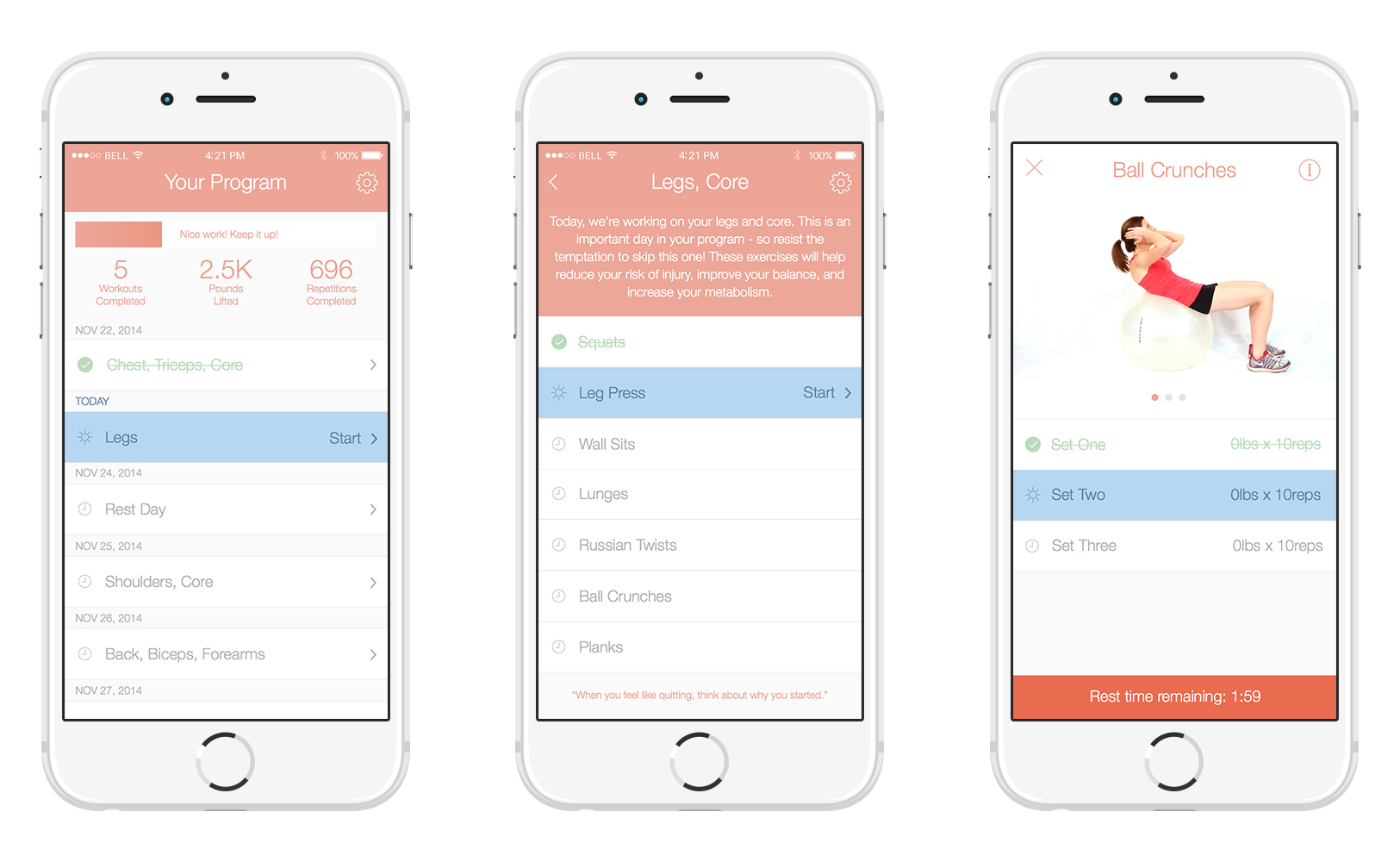
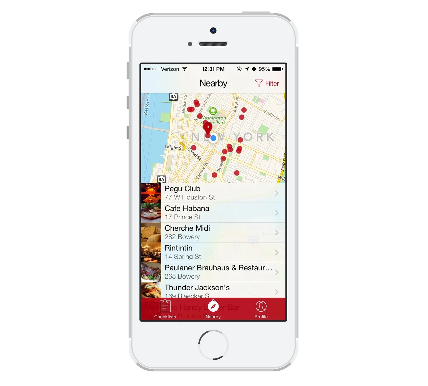
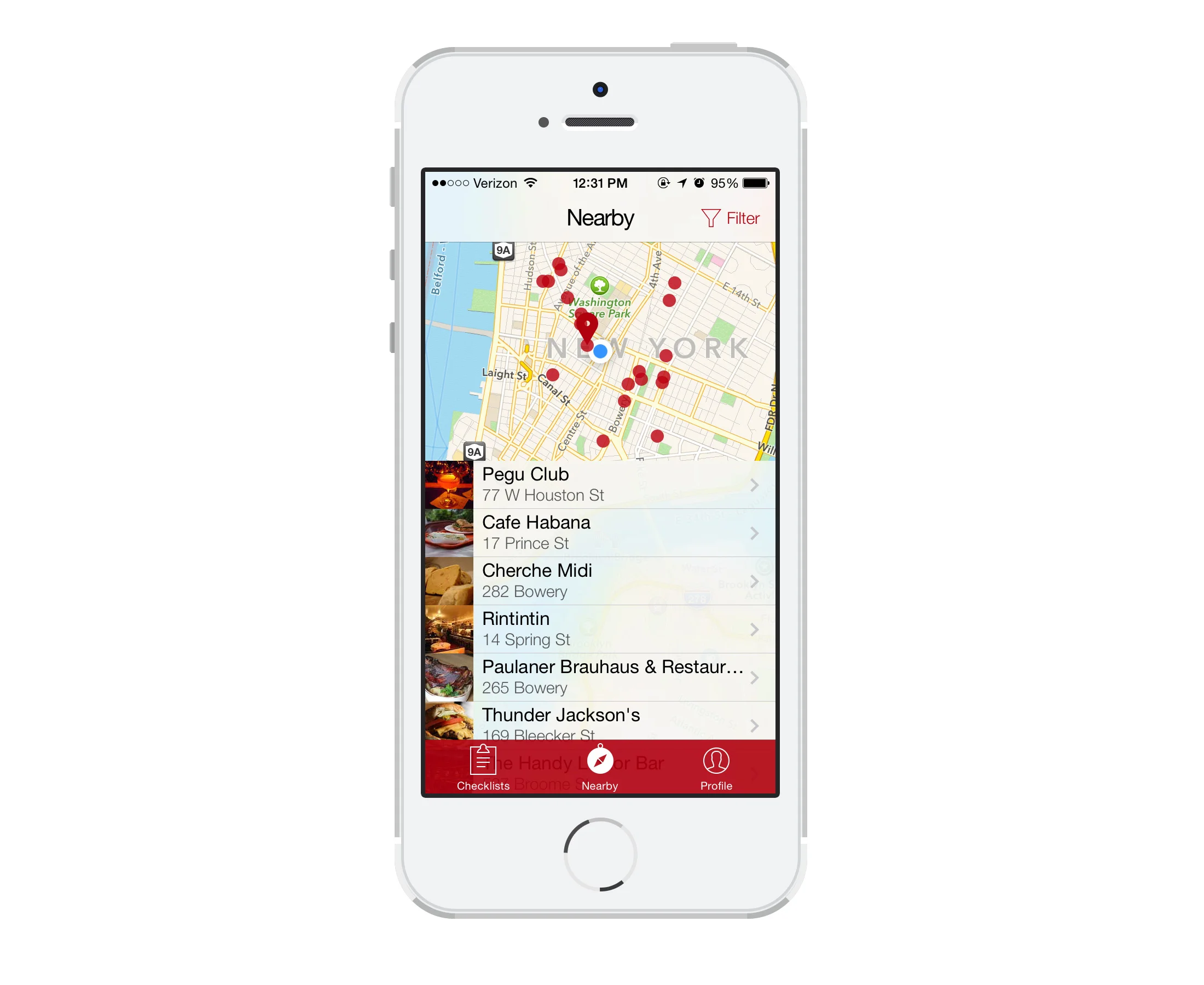
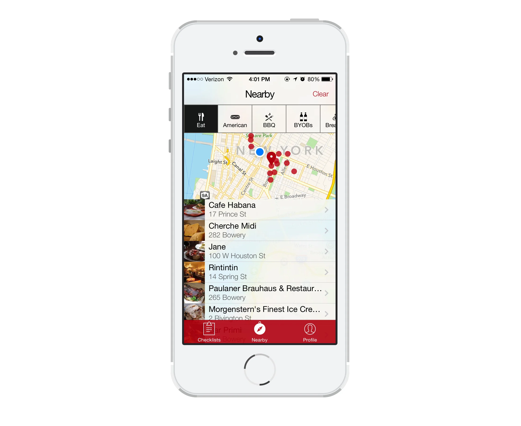
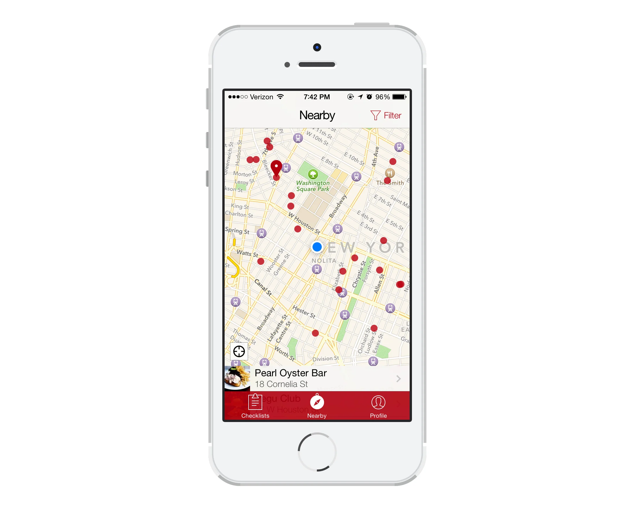
Additionally, since we didn’t have a tab bar in version 2.0, we used a weird floating circular button to take the user to a nearby map. Unfortunately, a lot of users didn’t understand what this button did! I made it a lot easier to get to the map by adding a “Nearby” tab to the tab bar.
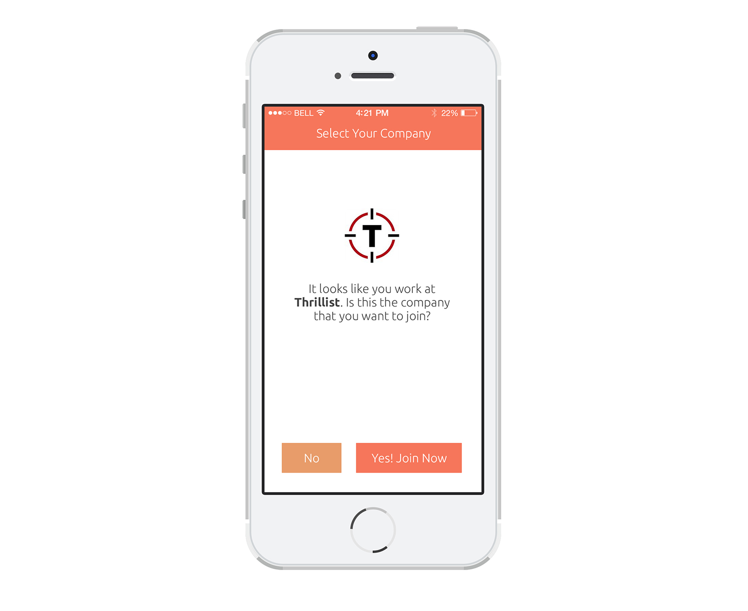
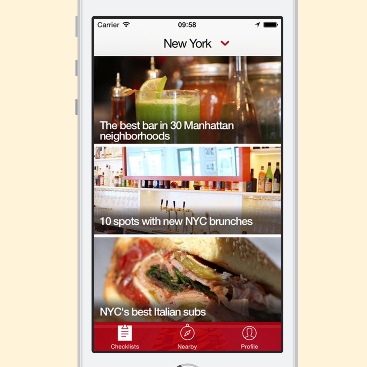
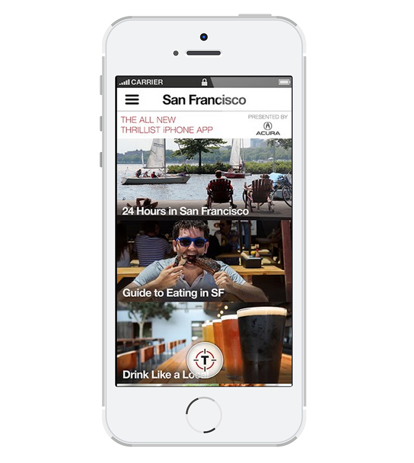
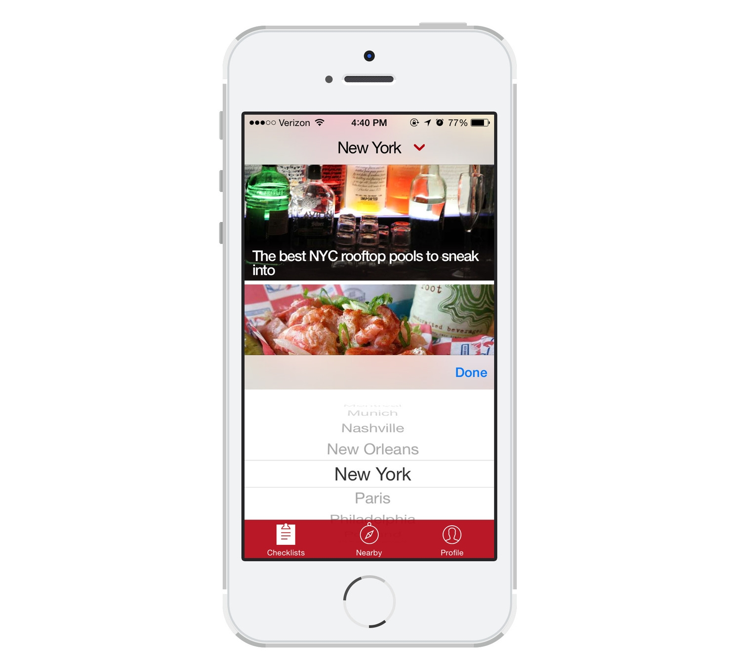
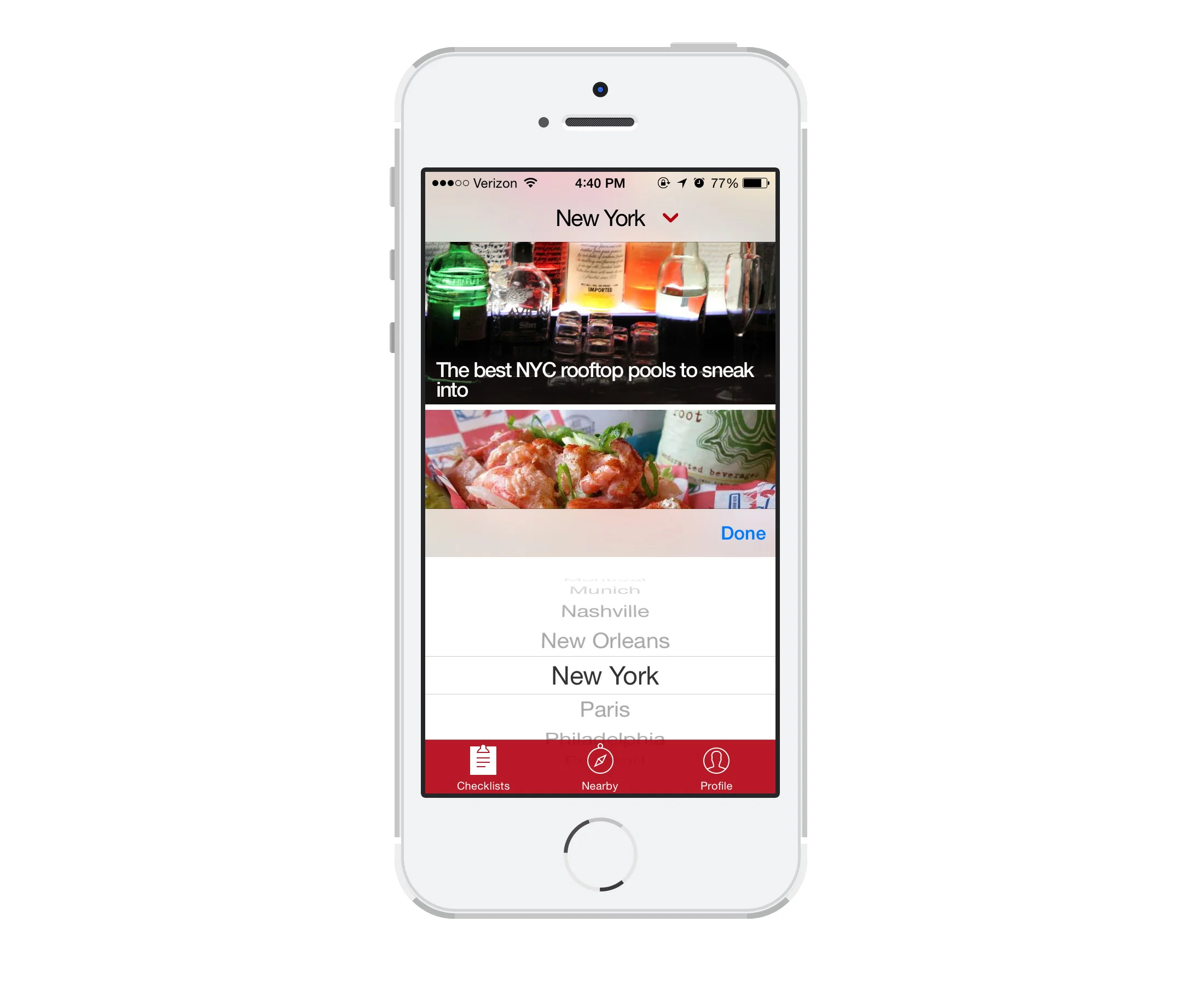
We used geolocation to find the user’s closest city (instead of making them choose from a list). Now, all that the user has to do to change their city is tap on the city name, which brings up the native UI picker, making it easier for users who are traveling to find places to eat and drink in their new City.
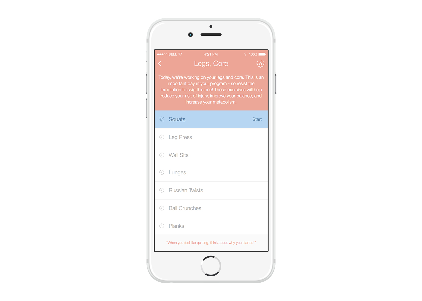
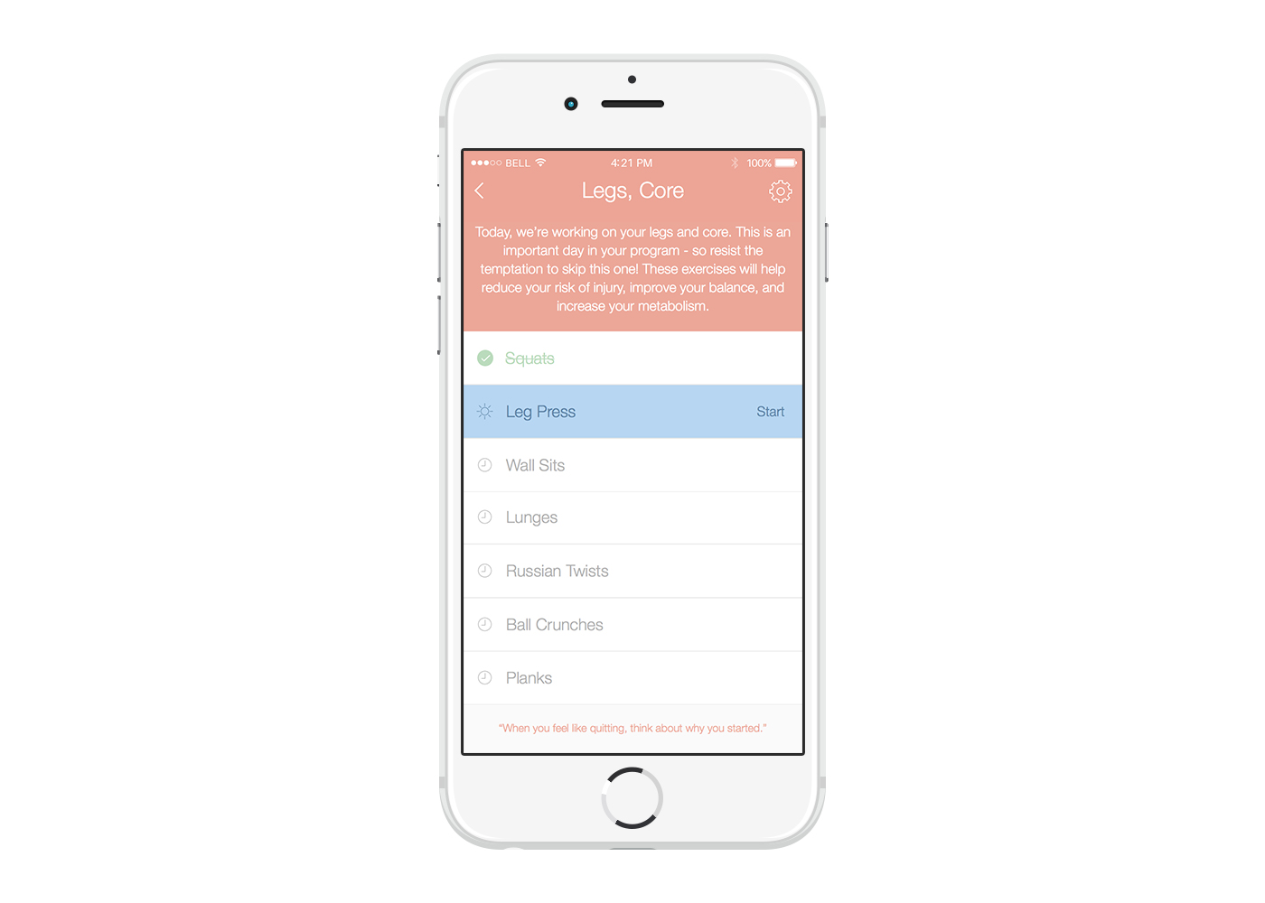
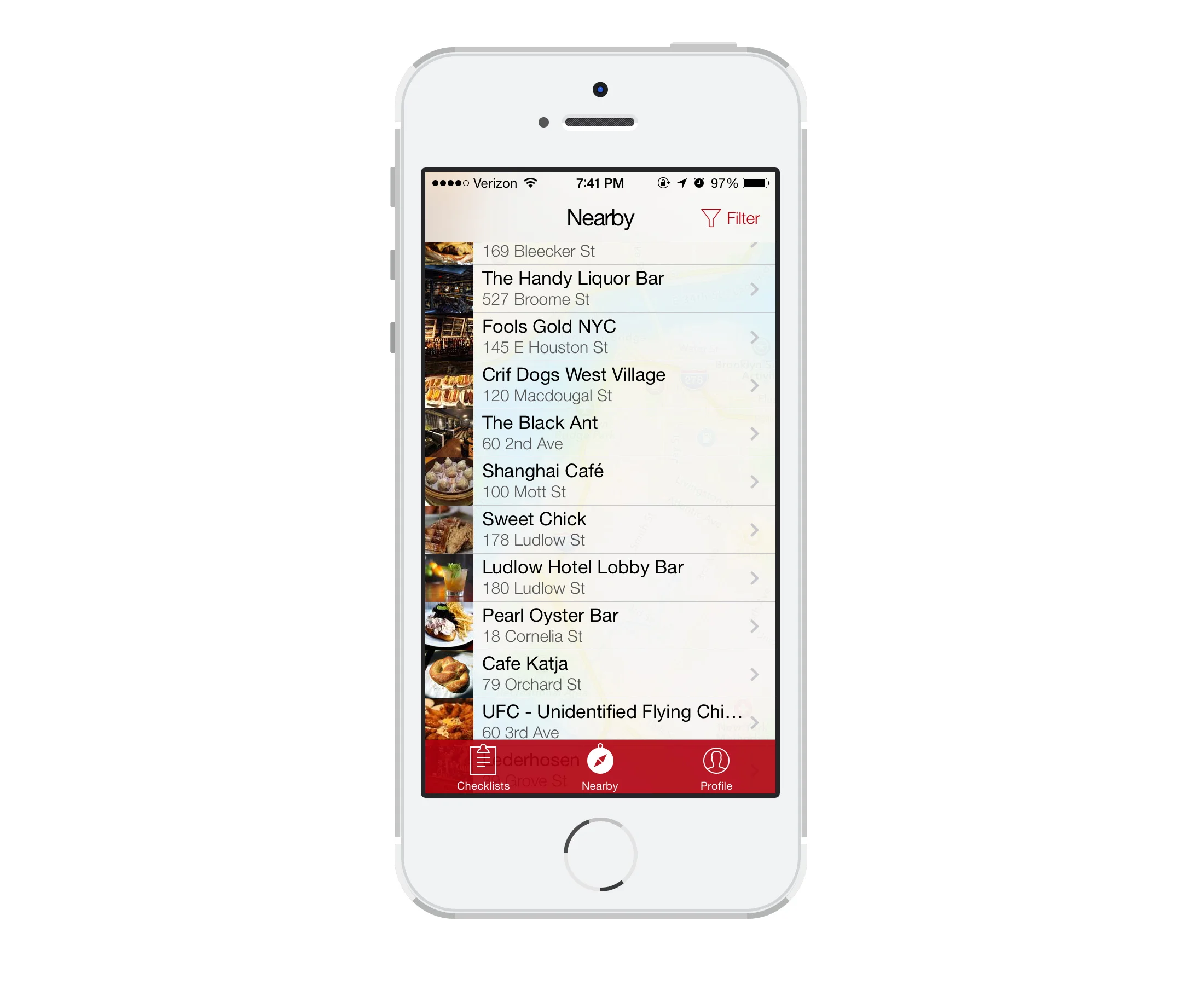
Based on user feedback, I simplified the Nearby map by combining the map and list view. You can scroll up to see the full list or tap on the map to make it full screen and explore the neighborhood. By putting the map and list in the same view, it gave the user a much better idea of what was available nearby. I also added venue thumbnails, which really helped give the user an idea of what type of venue they were looking at.
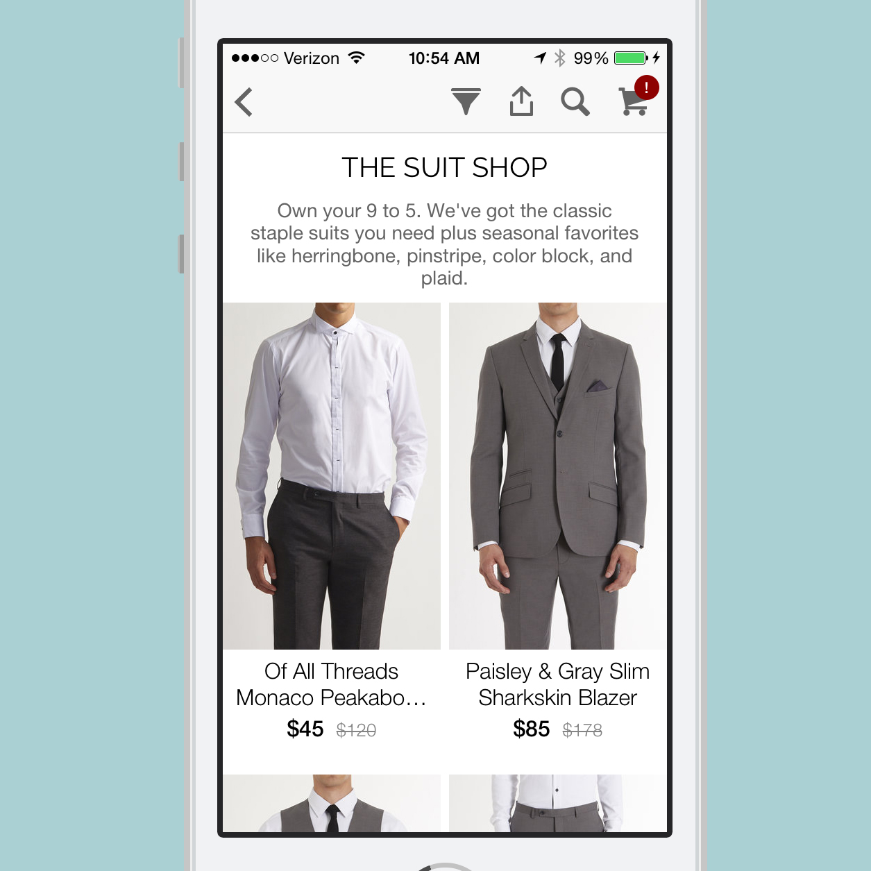
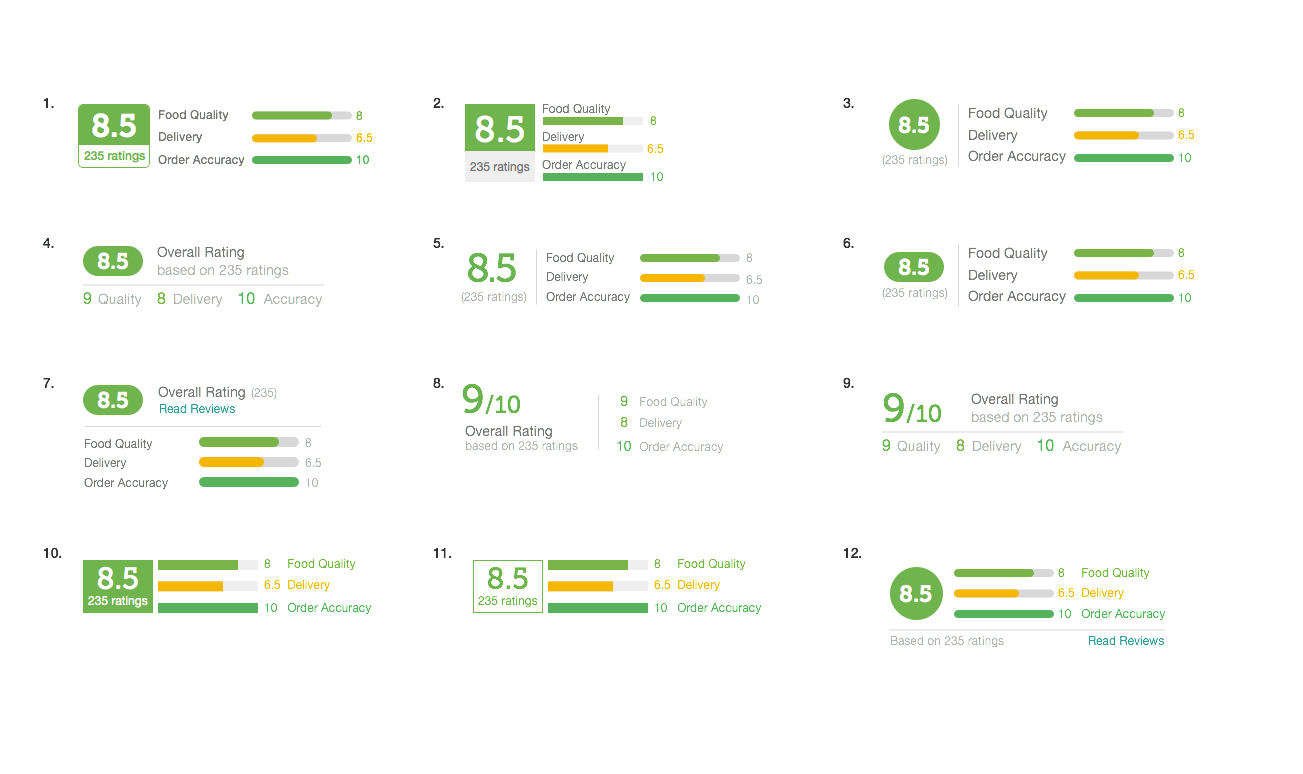
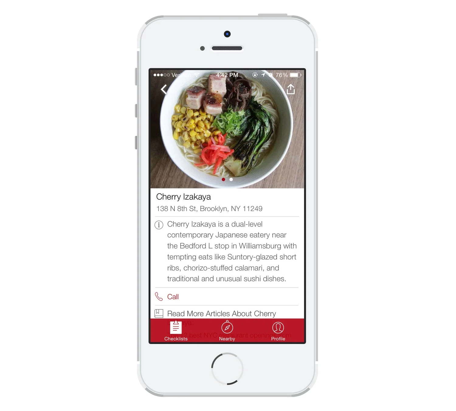
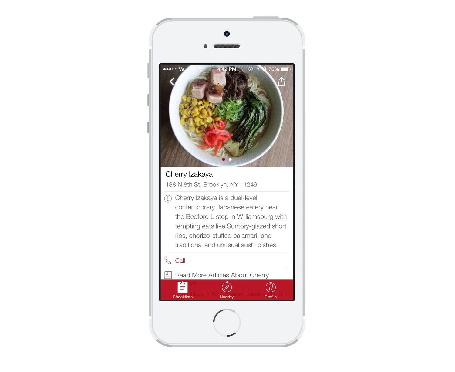
Venue pages in previous versions were cluttered and filled with confusing icons (without labels). Additionally, they didn’t really give that much useful information about the venue. We used the foursquare API to show hours, menu, and price range, and reorganized the information to make it much cleaner and easier to read.
Retrospective
As a result of the design improvements that I made to the Thrillist app, users became much more engaged. We saw more than a 200% increase in average session duration, the bounce rate greatly decreased, and the sign-up rate more than doubled.
If I had more time, I would have liked to incorporate more user research and usability testing into our process. Since we were pressed for time and resources, I experimented with some scrappier user research methods and we relied heavily on data and user feedback.
APP STORE REVIEWS
“Simply elegant! Very easy and light on the eyes”
“Everything we love about Thrillist, now in a FLUID, ORGANIZED, and INTELLIGENT design”
“It’s never been easier to navigate”
"I've been using this app to find awesome new date spots with the wife, and she doesn't even know. Thanks, Thrillist, for making me look like a hero!"
"My go-to for finding the good stuff."
"Great for when I travel. I don't live in an international city, but when I visit one I know where to go. It's never let me down."